 |
| src: https://github.com/DataScienceWorks/correlation_causation_blogpost/blob/master/cc_blog_post.ipynb |
What you should know quickly?
Given the observations of two features A and B: we observe correlation between features A and B, when we see a pattern where A and B change its values at the same time. When the values of A and B, increase or decrease together, we say they are positively correlated. When the value of A increases if we find that the value of B decreases proportionately and vice-versa, we say they are negatively correlated.Correlation is what we can visually identify by plotting the values of features in the graph and compare their trends for patterns. With this we cannot say what is causing what. In other words, you cannot claim one feature causing the other.
When the change in one feature results in the change in the other, we call it causation. When we find correlated features, we dig around the domain, do more research and homework to increase our domain knowledge to claim that one feature is causing the other.
Understanding with an example
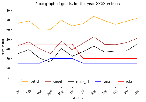
Take the pricing trend of 5 components Petrol, Diesel, Crude Oil, Water, Coke as shown in the above graph/plot.You will observe a strong correlation between Petrol, Diesel and Crude Oil prices.
You may also see some correlation in the prices of Water and Pepsi.
Now while the prices of water and Pepsi don't seem to change often as per the graph, we see a trend of rising prices during summer months in India. They both seem to be correlated and digging deeper we see that the increased demand for it during hot seasons cause its prices to go upwards.
In the case of gasoline components (or features, in the Data Science jargon), we see strong correlation in prices between Petrol, Diesel and Crude Oil. Among these, from just the graph data, can we say what feature is causing the change in prices of other features? No, we can't.
As Data Scientist or Researcher, we do some amount of homework to learn that Petrol and Diesel are derivatives from Crude Oil. Armed with this new found learning and coupling it with the graph data we shout out loud that Crude Oil price change causes or affects the change in prices of its derivatives like Petrol and Diesel.
Summary
Statistics provides you the tool to find correlation among features with quantitative data. It prescribes techniques to do your experiments for getting qualitative data or alternatively the domain knowledge aids you with the qualitative data, to identify a feature, if any, in the provided data, that causes other features.
By the way, have you ever wondered why we go through this pain or hassle of identifying correlated features and possibly the causal-feature?
Want to play with the data that is used to generate the graph plot used in this blog post? Feel free to download or fork it from my Github repository.
Happy learning!